We often measure the “size” of a feature based on how hard it is to build (development time) and how hard it is to use (for end users.)
So a “small feature” is one that’s easy to code and easy to use. But are small features really that easy to build? Coding a feature may be easy, but there’s a lot more that goes into feature and product development than the physical act of coding. And prioritizing features solely on development time is risky; it’s a slippery slope to feature bloat (or “death by a thousand paper cuts”).
Small features are not necessarily easily to build. Don’t underestimate the effort that will be required in terms of UI, UX, usability, deployment, customer understanding, and most importantly ROI. Small features sometimes end up being useless to customers, and sometimes make a huge difference in the overall value of your product. Suddenly a “small feature” that took very little development time is a “big feature” in terms of value.
At GoInstant we just launched our first new “small” features: Presenter Mode and Session Lock. Neither took long to develop, but the amount of thought and effort that went on behind the scenes was amazing. I don’t say that to be egotistical, or to claim that we nailed it perfectly (we don’t know yet!), but because the complexity of what we’re trying to do is significant, even though the end result is two tiny features.
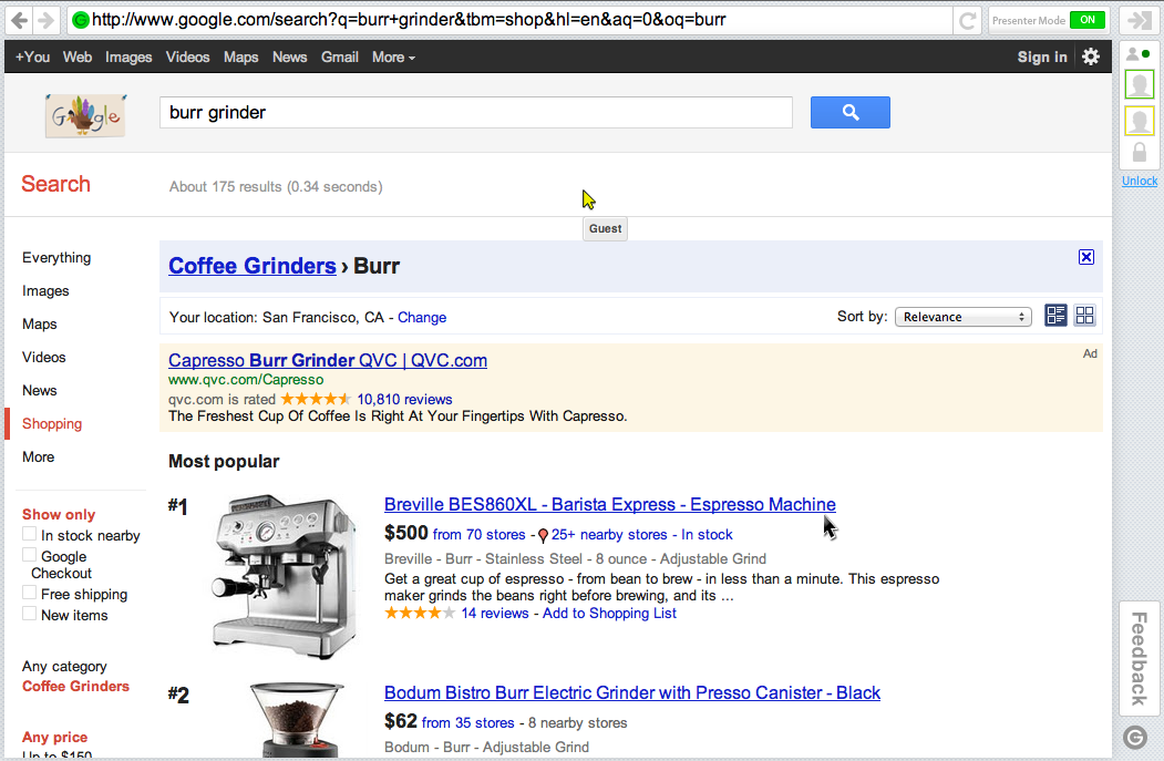
To illustrate the smallness of the features, here’s a screenshot of a GoInstant session:

- Presenter Mode is in the top right-hand corner. It’s a button – you turn it on or off – and when it’s turned on, only the session owner can interact with the web page. Guests can’t click or type (although they can move their mouse pointers), and the session owner can go through what they want. Turn it off and everyone can fully interact together.
- Session Lock is below the list of participants. It’s an icon of a lock (unlocked or locked) and a link for locking or unlocking the session. When a session is locked, no one else can join in. This provides security and privacy for the participants. When unlocked, others can join the session.
Small features. Easy to code. But we went through many iterations and discussions around the UI/UX and usability of the features. And even as we tested the features and new UI elements, we discovered potential issues. For example, guests can’t see the “Lock / Unlock” link, because it’s only something a session owner can do. But guests see the lock icon, because we feel it’s important for them to know what’s going on. So when a session owner locks a session with guests in it, she’s clicking into an empty space. That may be a weird experience for guests to see. And if it means the session owner has to interrupt her presentation in order to explain what she’s doing, GoInstant has gotten in the way. Our mission is to stay out of the way and bring you and your customers as close together as possible.
Session Lock = Small feature. Easy to code. Easy to use. But potentially confusing?
Designing the UI for Presenter Mode was even more difficult. We tried a number of options and discussed how prominent the indicator should be. We think people will understand the concept of Presenter Mode (based on customer interviews, feedback, terminology people used with us) but what happens if a guest is brought into a session, told it’s completely interactive, and then starts clicking … only to find that “nothing works”? Again, GoInstant’s goal is stay out of the way and facilitate awesome communication and interaction, so if session owners or guests start stumbling around the concept of Presenter Mode, we’ve done something wrong.
Presenter Mode = Small feature. Easy to code. Easy to use. But potentially confusing?
The Dreaded “Appendage” Functionality
When building new features they often come with “appendage” functionality. Appendage functionality is the stuff that’s put into a feature that’s not related to its core functionality, but plays a supportive role. Configuration settings/options are a great example. You build a feature and then decide to make it configurable (On/Off) or add settings to it so customers can customize how it works. This happens a lot – but if you can avoid it, you should.
With Presenter Mode we talked about “appendage” functionality a lot. For example: Should Presenter Mode be automatically on when you start a session? Or should session owners have to turn it on each time? The first instinct is to build a configuration option to let people decide how they want it to work. That’s more code, more complexity, more risk and potential points of failure. It also means more UI has to be designed, and once you go down that road it’s hard to pull back. Suddenly, every feature needs configuration options.
You have to be extremely cognizant of “appendage” functionality, and avoid it at all costs – especially at the beginning when you’re designing the minimally viable version of your feature. Instead of building configuration options, test the feature’s use and make decisions from there.
Usability Testing
GoInstant is a tricky product to do usability testing on because it requires two or more people to use it at the same time. So using a service like UserTesting.com (remote user testing) is tough. And having people come in and test the product is also difficult (although not impossible.)
At this point we’re deploying quickly to live customers and testing directly and actively with them. That’s a big part of our usability testing; but if your product can be more easily tested beforehand, do it. And be prepared for unexpected feedback. The Localmind team (I’m an investor through Year One Labs) recently went through a ton of very early, paper prototype usability testing and got some great feedback. That feedback gave Localmind the opportunity to step back, re-think, and tackle things differently. The results are guaranteed to be more successful than they would have been without putting in that legwork up front. It takes guts to do that kind of testing – especially before coding anything – but it can make a huge difference.
Thinking about the Future
GoInstant takes up as little space as possible. You can see from the screenshot that it’s a small bar across the top and right of the browser window. There’s not a lot of space to play with. And we plan on adding additional features as well. So a great deal of our discussions and iterations were around planning those future features. Some we know we want to build, some we’re still debating and collecting information on. We didn’t want to implement Presenter Mode and Session Lock only to have to change the UI later on, when new features are released. It may happen, but if we can avoid it, we’d like to. That’s a big part of product management – designing and building for today, planning and setting expectations for tomorrow. You can’t think of any one feature as independent of everything else.
Measuring the Value of New Features
Testing usability is important. Making sure things work the way you intended is also important. Squash the bugs. But at the end of the day, all that matters is whether new features are providing significant value or not.
To assess “significant value” you first need to define it.
If a new feature is used once per week, is that good? Bad? So-so? You won’t know unless you think about and write out your assumptions. Value is based on whether a feature is used or not, how it’s used, how often, if it’s being used as you intended (or maybe in other, better ways!) You need to know if features are providing value, but also what kind of value and how much.
Speak to customers and collect qualitative feedback. That’s essential. You want to collect as much feedback as possible. But every feature deserves its own quantitative analytics as well. Think about what you want to measure and how that would validate (or invalidate) the value of the feature for your customers/users. Bake those analytics in and see what happens. The combination of qualitative and quantitative data will be critical in deciding what to do next: keep the feature as is, change it (a little or a lot), or kill it. And yes, killing a new feature should be on the table.
Small is the New Big
On the surface, a “small feature” can seem so easy to build. And the easier it is to build, the more inclined we are to make it a high priority. How many times have you said, “Let’s just throw that feature in there, I’m sure customers will love it. Plus it’s so easy … we can bang it out in a couple hours, and promote it too.” Alarm bells should go off at this point. I’ve fallen into this trap a lot, but my warning bells have gotten a lot better over the years.
Don’t underestimate the complexity or impact of new features, including small ones…
 Founding Partner at