YourVersion is a newly launched web application from the Techcrunch50 conference. YourVersion is a discovery engine that looks to provide you with good content from all over (blogs, multimedia sites, social sites, Twitter, etc.) in an easy-to-use, aggregated way. It also has a toolbar for bookmarking (and categorizing) content, plus sharing. Tracking all the content you’re interested in online is a huge challenge; there’s just too much content and not enough time. So this is generally a huge problem that a lot of companies are working on.
Whether YourVersion will succeed or not remains to be seen. But what’s interesting (and a good sign) is their sign-up process.
The initial sign-up process and subsequent next steps in many web apps is done very poorly. It’s something I recently complained about in a blog post, Web Apps Don’t Motivate New Users Enough.
The key problem isn’t just the sign-up process and getting into an application but what you do immediately after. What hooks you to play around, test out and ultimately / hopefully, get hooked on the app?
If you follow Joshua Porter’s recent presentation – Designing for Social Traction – you’ll see that YouVersion is doing a lot of things right.
Click images below for larger versions:
1. YourVersion’s Home Page
The home page of the site could use a bit of work, but generally it’s OK. I don’t like the use of the word, revolutionary, but having the BuzzTracker and Twitter integration gives the site a real-time feel, which is important since that’s a key aspect of the site.
Having the video on the home page is a nice touch as well, to give people a deeper (but still quick) view of things.
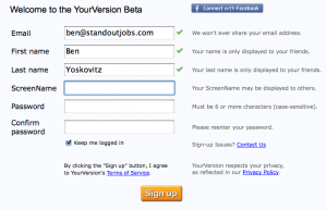
2. Welcome to the YourVersion Beta
There’s nothing incredibly magical about this page, but it’s simple and it works. The Facebook Connect option makes a ton of sense. I’d be curious to know how many people use that to get in versus the sign-up form.
I like the title of the page, Welcome to the YourVersion Beta. It makes me feel like I’m already participating. And the immediate feedback as I fill in form fields is a nice touch as well.
Again, there’s nothing revolutionary here – and I think they would benefit from telling me what step I’m on in the process, or how quickly I can get into things – but it’s a simple, clean and fast sign-up process.
3. Add Your Interests
This is the key step in the process. If people abandon here YourVersion is screwed. That’s probably not going to be an issue for the next little while as they ride the Techcrunch buzz, but over time this is the spot where they’ll need to measure conversion to the next step.
But I think they do a good job here. The process has been very quick and welcoming to-date, so I feel like I’m already participating and I want to fill in some interests. I do it quickly and move on, and this is where YourVersion does another smart thing:
They change what I’m shown on the right side, suggesting some popular interests. I like this step because it suggests some things that they’re likely very good at finding content for, and at least for the early adopters I’d bet there’s at least 1 or 2 interests that people will check off in there. (Again, that would be a great thing for them to test.)
4. YourVersion Toolbar
I’m now committed to the process, having provided my interests. I’m now motivated – and that’s key for the sign-up process. In my mind I’m already experimenting with the application and eager to see more.
I can skip the toolbar, but downloading it isn’t that painful an experience, so I do it. I even have to restart Firefox but I’m committed, so I go through the process.
5. Registration Complete!
The registration process is complete, and YourVersion does another smart thing by giving me the option to view the video. I’m more than likely going to just jump right into “start discovering” but I might pop open the video anyway for future reference.
It’s also a very smart move that I don’t have to verify my email address to get in. I can start discovering right away, and verify the email address after the fact. Having to jump into email to verify is a buzz kill.
6. YourVersion Discovery Page
Here’s what I see immediately after getting into the application. The video is again there – a great way to teach me how to use the app more thoroughly. Two links are highlighted in the right sidebar – one is for a survey. This is a great move: getting people to complete a survey as soon as possible helps collect a lot of valuable data about people’s expectations (as they were signing up), what they’d like to see, etc.
The sign-up / initial workflow into YourVersion isn’t ultra fast – there are a fair number of steps, especially with the installation of the toolbar. But they engage the user quickly and keep the pages very basic. The information is clear and I get more and more curious about the application as I go through the process. It’s quite clear what the application does and what I can (and should) do after signing up.
The sign-up process into a web app is critical. Equally as important (if not more important because of how easy it is to sign-up for most web apps these days) is what you ask the user to do immediately thereafter. For YourVersion it’s really the step of adding your interests (since just prior to that you completed the “standard” sign-up form.) From that point forward they’re working to get you motivated and engaged with their product even if you haven’t discovered anything yet.






 Founding Partner at